Stalk & Spade
Branding + marketing + Photography
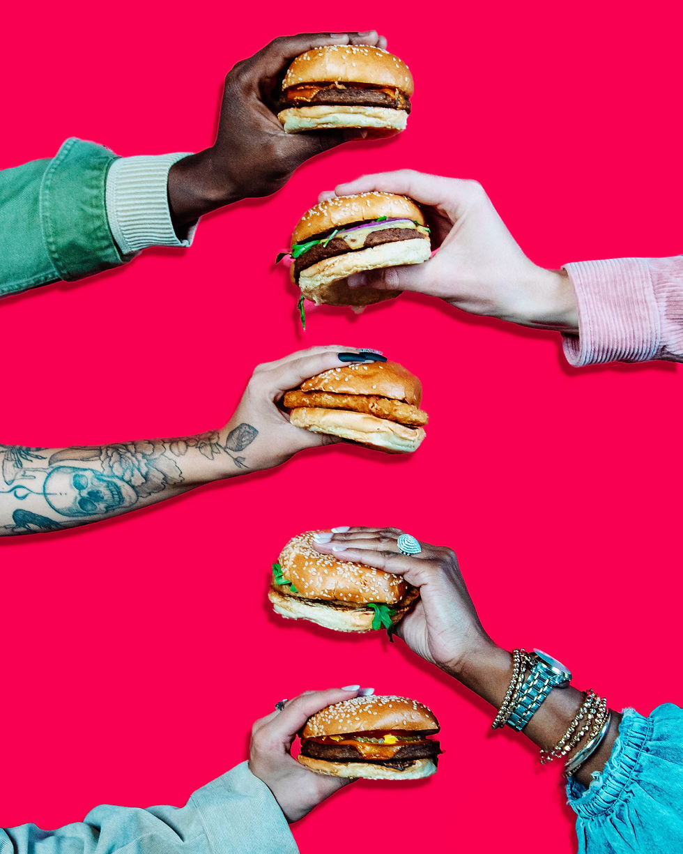
Stalk & Spade was a fast-casual, plant-based restaurant brand offering a modern take on classic comfort foods. I developed and refined brand standards, designed marketing collateral, and created digital assets to support campaigns and new store launches.
Logo Redesign
When I started at Stalk & Spade, it had been decided that the original logo needed some slight tweaking and if it was going to happen, it needed to be when the company was still young, because additional stores were in the works and it would get expensive quickly. So I reworked the logo to what became the final mark.


Before
After


Print menu design

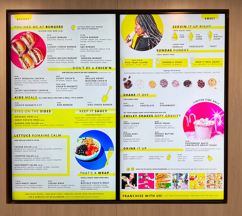
Digital Menu Board Design
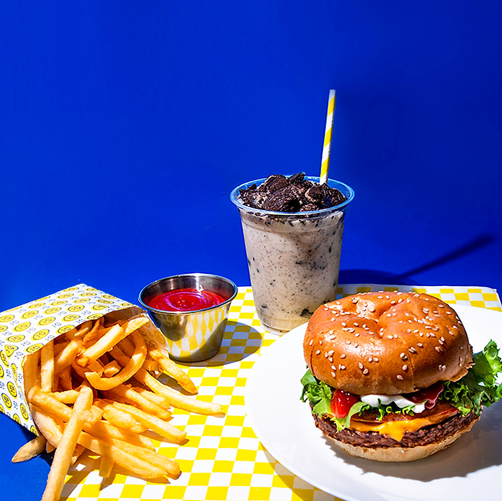
The digital menu boards were both animated and had video attributes. Along with the entire design, I took all the product photos and updated them regularly.
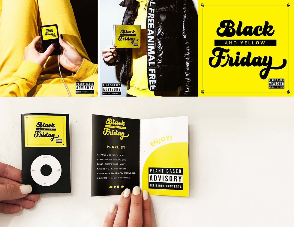
black friday marketing campaign
Based on the popular song "Black and Yellow", I pitched the idea of running with taking our brand colors literally and taking the name of the song literally. We had so much fun finding an old iPod, CD case, and I got to recreate the album artwork to match our brand. I also created a fun parody on the "parental advisory" label, but spun it to say "plant-based advisory.